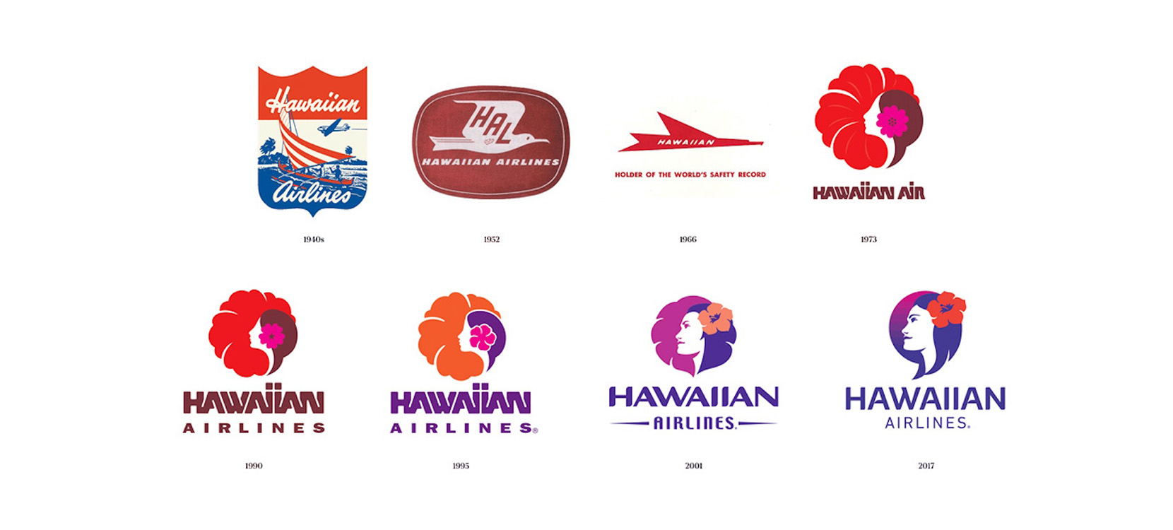
For many of the world’s most iconic companies, the value of brand recognition cannot be stated highly enough. Although a company such as Hawaiian Airlines may be decades old, their logo is a great example of a dynamic logo that has continued to evolve to reflect the company’s changing mission and values.
Even small businesses can outgrow the branding of their early years, and in fact half of the small businesses I design for already have an established logo – and are looking for a brand refresh.
In many cases the business owner has been relying (unhappily) on the same old jpeg logo for years without any variations – or even a proper vector file of their logo.
So whether you are evolving your brand or starting from scratch, here’s my guide to what you should ask your logo designer to provide you with.
Logo variations
These days there is a huge range of platforms and mediums to use your logo, and one style of your logo just won’t cut it. The number of variations will typically depend on how complex your design is, but as a general rule of thumb you need the following three versions of your logo:
1. Horizontal logo
2. Vertical logo
3. Brandmark or icon
4. Wordmark (optional)
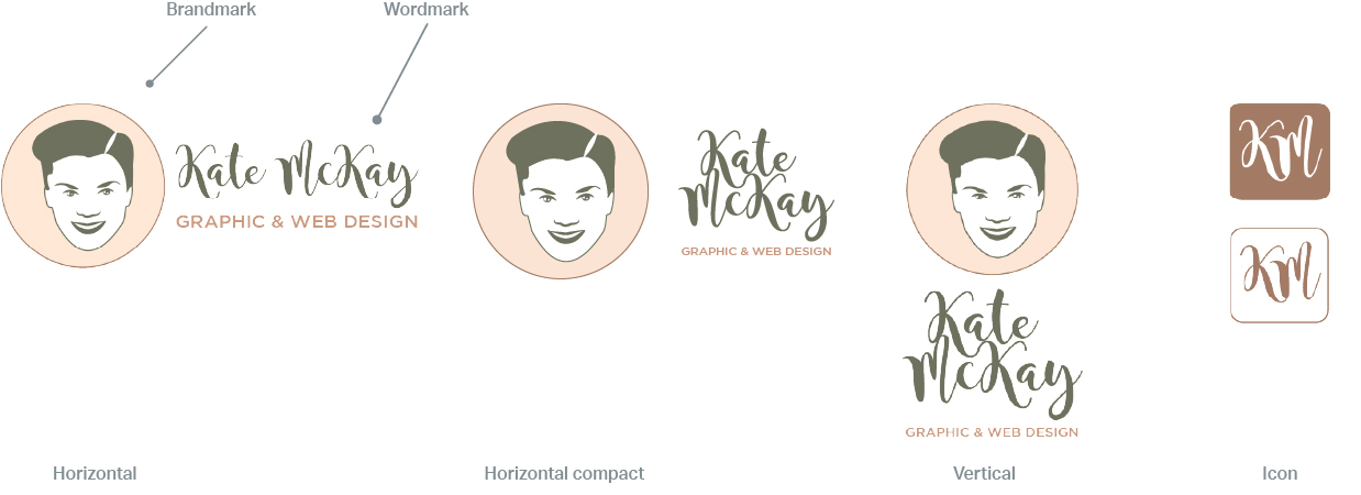
For websites or printed material, a horizontal logo is typically best but a vertical or stacked version can work well on swag, posters or signage. If you look at my logo versions below you will see that I also have a horizontal compact version, which I use for in-between times when I want something horizontal but without taking up too much space.
Some logos will only have one orientation, but if you’re in the design phase and looking for flexibility, ask your designer for both a horizontal and vertical variation of your logo.
I have both a brandmark and an icon, but I never use a wordmark and question if it is really needed. I use my icon on my website as a favicon (you should see it on the browser tab when you’re on my website) but I also like it’s shape and simplicity for small square stickers.
In any case, whatever logo variations you have I always suggest choosing one main form of your logo which you mostly use to build brand recognition, rather than jumping between all of your variations.
Colour variations
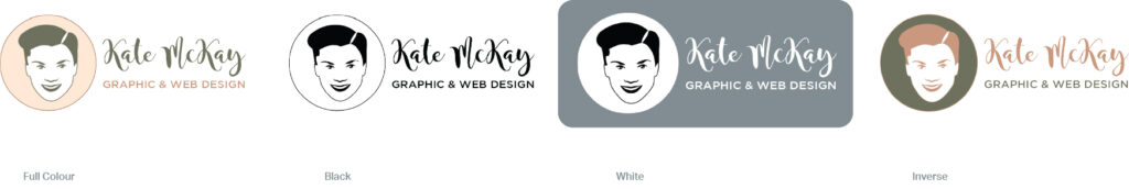
Your logo will not always be in full colour on a white background, so it’s important to have some colour variations. At a minimum you will need a full colour version, plus an all black and an all white variation (for dark backgrounds):
1. Full colour
2. Black
3. White
4. Inverse (optional)
Perhaps the least used of these variations is an inverse logo, which flips the colour palette to the opposite. I rarely use mine, but can be a nice ‘shake up’ version of the logo for a special occasion when you want to stand out.
File formats
There are all kinds of file formats out there but the majority of your needs can be met with the following three file formats:
1. JPEG
2. PNG
3. SVG
4. EPS (optional)
As image files, the main difference between JPEGs and PNGs is that PNGS usually have a transparent background and so they can be applied to all kinds of colour palettes. With a solid white background, JPEGs are still quite popular but don’t have the same flexibility.
SVGs are your best choice for websites as they are a vector file type which means they can be scaled up or down to any size without pixelating. This crispness is particularly noticeable on larger screens, but they also look great in print. So if you’re doubt, use an SVG.
For a long time EPS was the industry standard for a logo file. However they are now becoming a bit outdated and dying out (except for the occasional old school print shop). I’ve included this as optional as editable PDFs are becoming more common for printers these days.
Being busy business owners, most of the clients I work with would prefer not to get into the nuts and bolts of their logo (or websites too actually). So I don’t include an AI file, but if you want to be able to export multiple file types of your logo or make your own edits make sure to ask your designer for an AI file.
Image sizes
Last but not least is a suggestion on image sizes. As already mentioned, SVGs can scale to any size, so you just need one SVG. However, with your JPEG and PNG image sizes I typically recommend:
1. Large (no bigger than 2000px wide)
2. Medium (around 1300-1500px wide)
3. Small (200px wide)
There really isn’t a standard for logo sizing, but with three variations and an SVG this should be more than enough to cover most situations.
As you can imagine, there is quite a bit of work involved in preparing the logo package with all of the variations, colour choices, file types and file sizes. This flexibility, quality and appropriate logo type for any situation is one of the differences between a professional logo design and a cheapie from one of the logo bidding websites. The end result is a beautiful logo that shows off your brand, looks fantastic in any situation and really lasts the distance.